



Improving the teacher experience on DonorsChoose
Three years of teacher-facing work at DonorsChoose: growing fundraising, getting more projects funded, and launching Classroom Essentials.
- Role
- Product Designer
- Company
- DonorsChoose
- Year
- 2023–2026
- Focus
- EdTech · Lifecycle · Teacher experience · Web
Overview
DonorsChoose is a nonprofit where public-school teachers crowdfund what their classrooms need: a teacher posts a project, donors fund it, and DonorsChoose buys the supplies and ships them straight to the school.
For three years I worked on the teacher side of that platform. The goal throughout was to make it easier for a teacher to get a project posted, and more likely that it gets funded once it's live. Teachers are doing all of this after a full day of teaching, and every hour spent fighting a form or guessing at how to promote a project is an hour not spent with their students. Getting a classroom funded shouldn't feel like a second job.
What I did
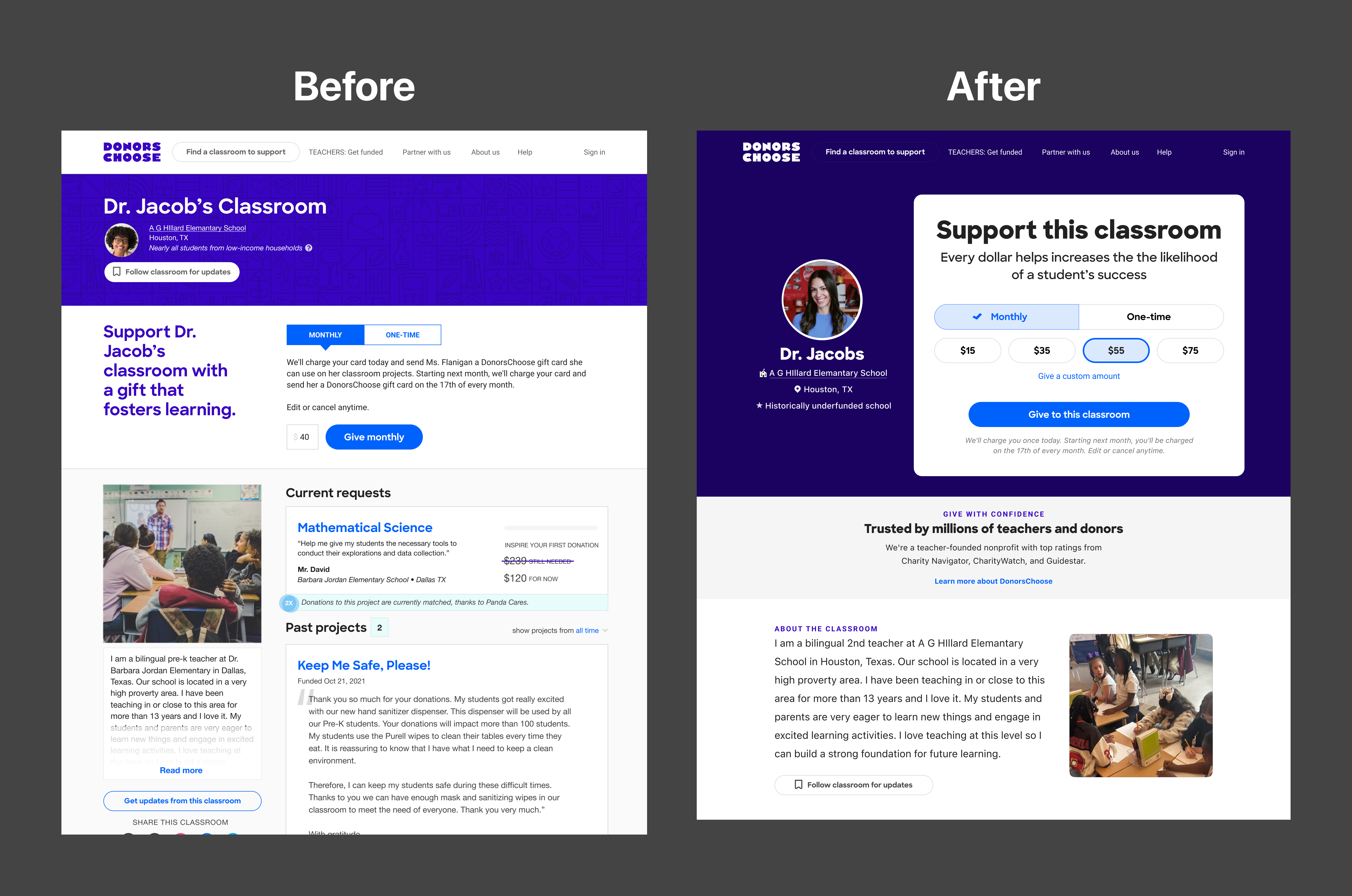
Refocused the classroom page on fundraising
Almost everyone who lands on this page got there from the teacher, so they are usually a friend, a family member, or someone else in that teacher's network. They came to support the teacher, not to read up on a project. The old page assumed the opposite, so I moved the ask above the fold and made it bigger and clearer.
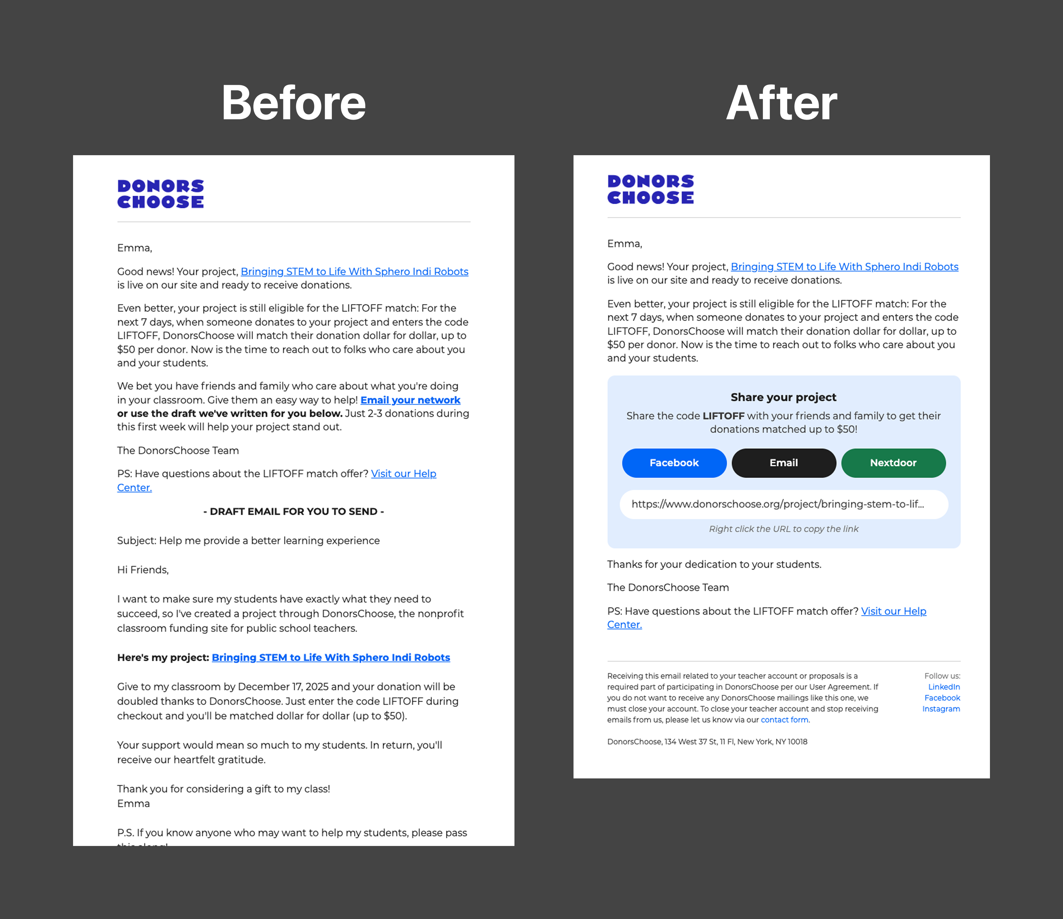
Rebuilt lifecycle email around sharing, and fundraising revenue doubled
Before this, a teacher had to come back to the site to share their project. Now the ask goes to them, timed to the moments when sharing actually pays off: right after a project is approved, or during a week when a partner is matching donations. Putting one-tap sharing directly in the email doubled the revenue we made through that channel and brought in a lot of first-time donors.
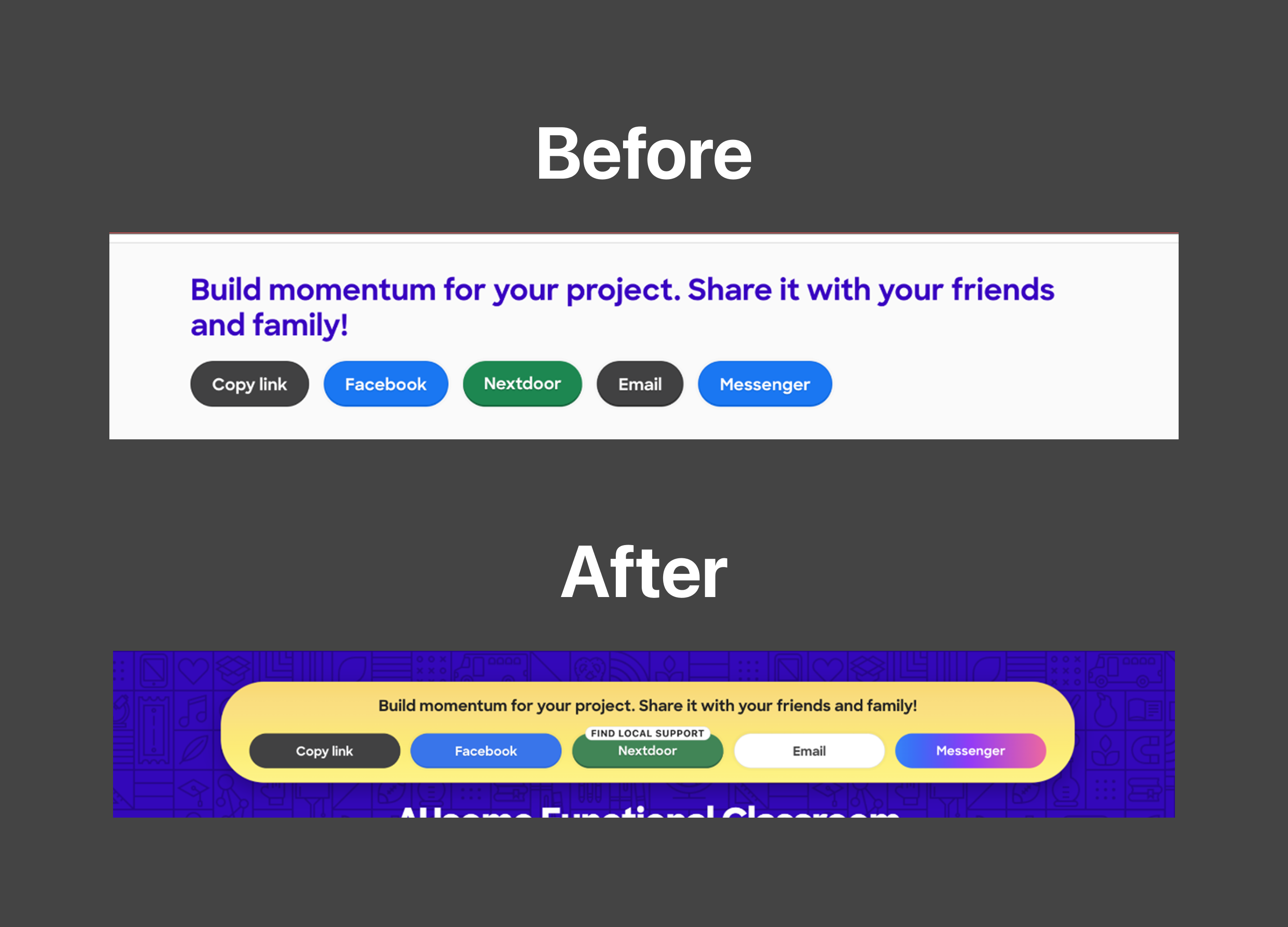
Redesigned the share bar, lifting sharing 50% and revenue 25%
The new share bar is harder to miss and stays pinned to the top as the page scrolls. I called out Nextdoor specifically. Most teachers were not using it, but it reaches a whole local neighborhood instead of just the handful of people a teacher knows well enough to ask directly.
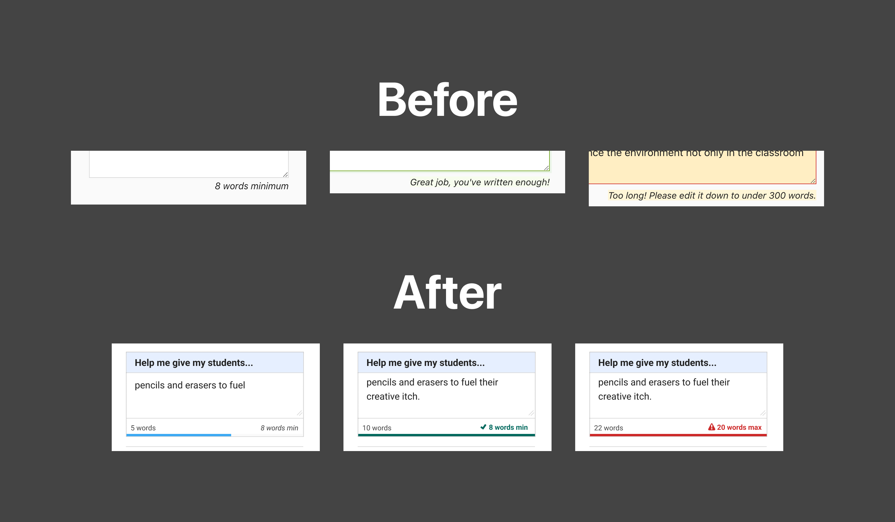
Rewrote the word count so teachers stop treating the minimum as the goal
The old form told teachers "Great job, you've written enough" the moment they hit the minimum, and most of them read that as a cue to stop writing. The new meter shows the live word count against both the minimum and the maximum, so it is clear the number is a starting point and not the finish line.
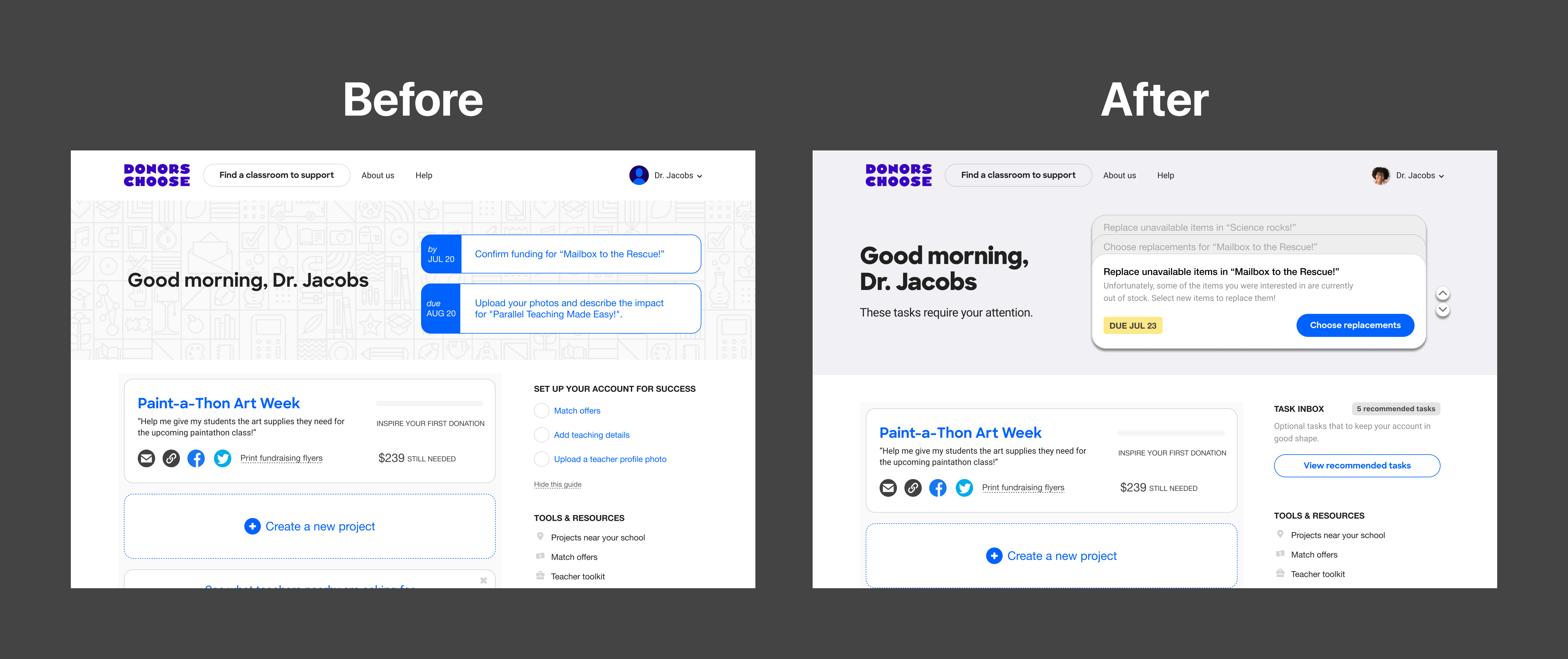
Centralized the teacher hub around one task at a time
All of a teacher's notifications now live in one place. Instead of showing everything at once, the hub gives them one task at a time, with its deadline and what to do about it.
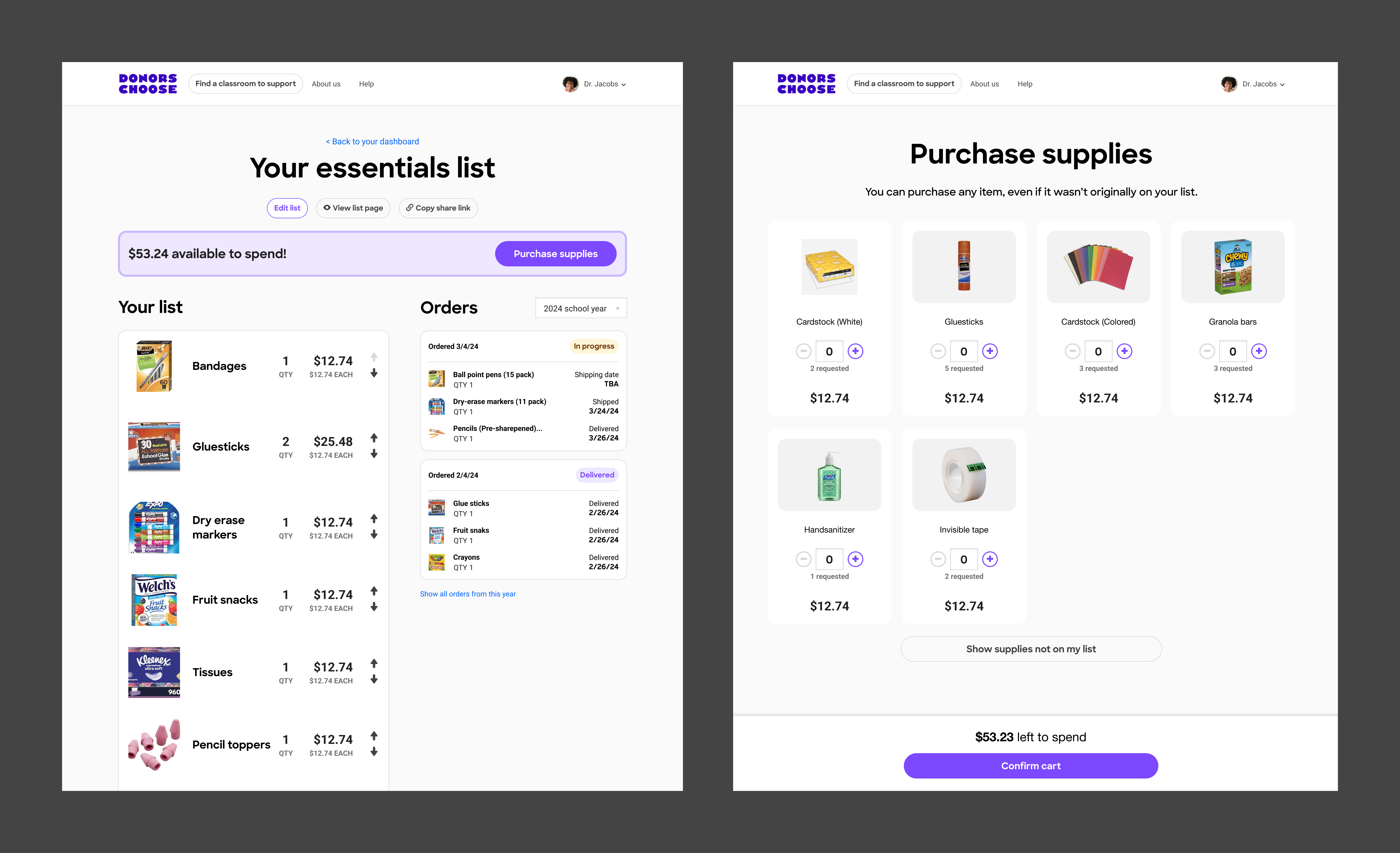
Launched Classroom Essentials, and new teacher sign-ups went up 40%
A new way in for teachers who are just getting started. There is no project to write. They pick the classroom basics they need and they are live in a few minutes instead of an afternoon. New teacher sign-ups went up 40%, and 34% of those teachers went on to create a full project.
Other accomplishments
- Designed the Teacher Appreciation Week experience across the site and email, so the week actually felt like a thank-you to teachers instead of another campaign.
- Built an AI-assisted prototyping workflow that the design team picked up, which made it a lot cheaper to test an idea before asking engineering to build it.
- Dug into fundraising funnels and performance metrics to find where teachers were dropping off, then used that to decide what went on the roadmap.
- Took work from design all the way through front-end implementation in HTML, CSS, and JavaScript, which cut down on handoff and kept the shipped version close to the design.
- Ran A/B tests in Optimizely on every redesign, so we shipped changes knowing how they actually affected teacher behavior.
Next case study
Getting underwriters from inbox to a decision →